
I’m Building the Perfectly Imperfect Brand, and It’s Killing Me
Polished is safe. Safe is forgettable. So why can't I stop doing it?

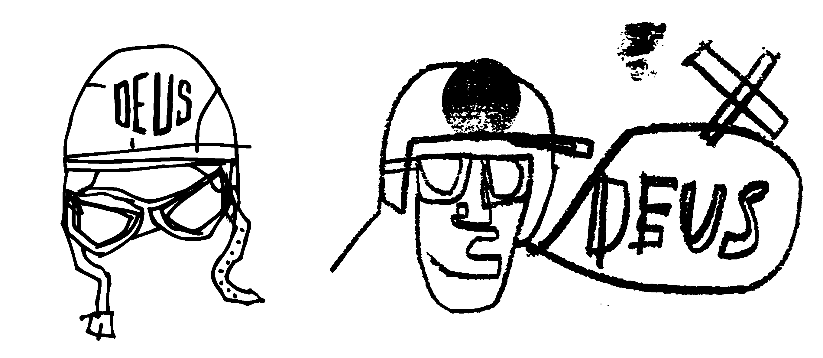
There’s a special side of tortuous hell reserved for designers, who grew up designing for the grid, but are now trying to make things intentionally rough.
You know the aesthetic — looks like it was drawn on a cocktail napkin by someone who was late for something more important. Loose lines, uneven letterforms; the kind of mark-making that mutters, “I made this with my hands instead of beating it to vector submission in Adobe Illustrator.”
That’s the vibe I’m going for with my brand, Lost Mixtape, but I didn’t start with that, and no matter how hard I try to get rough with my style, I can’t stop myself from trying to tweak it into perfection.
I’ll start a sketch with all the right intentions — loose, expressive, organic (I literally cringed while typing that word, but whatever). Then I open it in Procreate or Affinity. I nudge an anchor point, or warp a line there, and another, and another.
Before I realize, I’m forty-five minutes deep into a rabbit hole of optical corrections and suddenly my hand drawn design looks like it was drafted by a very convincing robot with a specialty in calligraphy.
This Isn’t About Aesthetics
Here’s where it gets interesting, and why I think this matters beyond my own creative neuroses.
Real buyers, the ones who pull out their wallet on impulse (instead of the ones I begged or bribed to purchase) are not looking for perfect. They’re looking for honest. There’s a meaningful difference between the two, and most brands confuse them constantly.
When I think about the brands I love most; not the ones I respect at a distance, but the ones I actually feel something about; chances are, there’s rough edges somewhere. A logo that’s slightly off-center by design, a label that looks like it was painted on someone’s ‘78 Ford Econoline, or a font that has no business working as well as it does, even if only once.
Those choices aren’t accidents. They tell the buyer these items were made by a human with a point of view. That is worth more, psychologically, than any amount of visual polish.
There’s a concept in buyer behavior called benevolent imperfection — the idea that minor flaws in a product or presentation can actually increase perceived authenticity and, by extension, trust. It’s why a handwritten thank you note in your package hits different than a printed insert. It’s why the slightly crooked label on a craft hot sauce makes you trust the recipe more.
The rough edge is the receipt. It proves a person was here.
So why is this so fucking hard for me?
I’ve spent nearly thirty years being paid to make things look correct. The instinct toward precision isn’t a character flaw — it’s scar tissue from years of client revisions, brand standards documents, and the specific kind of suffering that comes from a creative director who doesn’t know what they want but will absolutely know it when they see it.
I expect every graphic designer reading this to feel that last part in their taint — yeah, I just said it, and I expect you to make a comment on this post if you know exactly what I mean.
I am technically proficient in a way that keeps working against me. Getting truly loose requires me to make decision that feel, at a cellular level, like a mistake. No fixing, no tweaking, no nudging, and definitely no squinting to make sure the spacing between the typography is balanced (Yes, I actually do that shit).
This is harder than it sounds. Ask anyone who’s tried to write badly on purpose; controlled chaos is still control.
What I’m learning, slowly, and with no small amount of resistance, is that the style I’m chasing for Lost Mixtape is a philosophy, not just a visual preference. The analog nostalgia we’re celebrating, the pulling back from digital perfection, the more-human moments ethos; it has to show up in the work itself.
You can’t build a brand about embracing imperfection while quietly perfecting everything in the background. If the medium is part of the message, the rough lines are the discourse, but damn, it is so hard to pull off.


Right now I’m slowly building out the catalog; more designs, more items, more opportunities to test this aesthetic in the wild before I start pushing hard on marketing and visibility. I want there to be enough there that when someone lands on the page, they get it immediately.
The vibe must be legible before the pitch can land.
Somewhere between the initial sketch and the final file is a version of the work that feels true; real. I’m trying to learn to stop before I get there so I can see it coming, not going too far. Twenty years of muscle memory says that’s wrong, but the brand ethos says otherwise.
The harder truth is that I have designs sitting in a folder right now that I’m afraid to use. Not because they’re bad, but because they don’t yet match the thing I can see clearly in my head. I know, rationally, the only way to close that gap is to ship them anyway. Let the work exist in the world before it’s ready, and let the audience vote with their dollars, so it can become what it needs to be.
The perfectly imperfect brand won’t build itself while I’m waiting to feel ready.
If you’ve ever fought your own instincts while building something, whether that’s a design, a business, a habit; you probably know this particular feeling: The pull toward safety dressed up as professionalism.
What that looks like for you, if you want to share it?
Lost Mixtape is my premium clothing brand built around pulling ourselves out of our screens and into more human moments through analog nostalgia. You can find the shop at lostmixtape.com.
I feel ya man. I still remember in college our professor teaching drawing had this exercise: draw that bowl of fruit and you have 20 minutes. Then he ratcheted down the time to 10, 5, 2, 1 minute and the final challenge - draw it in 30 seconds. I learned that the progression was needed for us graphic design students to get to loose, it was not doable with one ratchet down but it took 3, 4, 5 ratchets down.
Maybe there’s a similar ratcheting down process for these, where you have to start tight and loosen by degrees? It’s very much a process after being trained to ratchet the other way all of your career.
Raising my hand having resonated with the built up scar tissue of “perfect”. Lots of good stuff here that hits, and there’s some sadness that comes up for me…when we are no longer serving the boss or client with our work we must serve ourselves, and that scar tissue has often prevented me from truly knowing what I love, what I really want… A few questions I’m left with for you (and for me, as I ask them I’m learning) Lost Mixtape is the brand…what does that mixtape sound like? Where is it? Have you made contact with the “tape” and dropped it into the cassette player, what record did you drop on the table today, what liner notes did you pour over? How can the work find a stronger connection to the namesake? The nostalgia for good old days and past technologies be translated into graphics? Thanks Dave!